So you’re launching a branded podcast. Or you’ve had one running for a while, and someone just asked whether the cover art is doing its job.
Either way, you’re looking at a square, wondering how much it really matters and how much of your week it deserves.
Fair thing to wonder. And if your honest answer is “we approved it before launch and haven’t thought about it since,” you’re in very good company.
Here’s the thing: For a branded show, that square is working harder than you think. It’s the only piece of your marketing sitting in front of a buyer while they decide what to listen to. So how do you make a podcast cover that stands out and pulls people in? Don’t worry, we won’t leave you hanging.
This post covers the platform specs, the design decisions that actually matter for brands, a brief you can send your designer today, and how to tell afterward whether any of it worked.
Podcast cover art sizes and specs
Let’s get the numbers out of the way first, because this is probably why you’re here.
Design one file at 3000 x 3000 pixels, square, in RGB, saved as a JPG or PNG with no transparency.
That single file works for Apple Podcasts, Spotify, Amazon Music, and YouTube Music, which covers most of where your show ends up. Your podcast host pushes it out to the directories through your RSS feed, so you only upload it once.
The one exception is video. If you post episodes to YouTube as video uploads, you’ll need a separate wide image.
Spotify and Apple Podcasts cover art requirements
- Size: 3000 x 3000 pixels preferred. Apple’s minimum through an RSS feed is 1400 x 1400; Spotify’s own minimum is lower, 640 x 640, but there’s no reason to design that small.
- Format: JPG or PNG
- Shape: Square (1:1)
- Color: RGB
- Transparency: Not allowed. Put a solid color behind your design before you export, and make sure no transparent layer is left in the file.
Keep the title clear and easy to read, maintain strong contrast between the text and the background, and keep anything important away from the edges so it doesn’t get covered by play buttons, labels, and subscription prompts. Apple logos and photos of Apple devices aren’t allowed.
(These content rules, including the no-Apple-logo rule, come from Apple’s own spec. Spotify publishes its own cover art requirements separately, with a lower 640 x 640 minimum, but no equivalent content restrictions.)
YouTube podcast artwork requirements
- Square show art: 1280 x 1280 pixels, JPG or PNG, RGB
- Video thumbnails: 1280 x 720 pixels (16:9), 640 pixels wide at minimum
If you publish video, please don’t just crop your cover into a rectangle. A thumbnail is its own design job, and our guide to YouTube thumbnails for podcasts walks through it properly.
The other sizes you’ll need
This is the part most teams discover three weeks after launch. Ask for all of these at the same time as the main file:
| Where you'll use it | What to ask for |
|---|---|
| Podcast apps | 3000 x 3000 square, the main file |
| YouTube video episodes | 1280 x 720 thumbnail |
| LinkedIn and social posts | 1200 x 627 and 1080 x 1080, with the title moved rather than cropped off |
| Your show page | The square, plus a wide banner version |
| Email and newsletters | 600 pixels wide, checked on both white and dark backgrounds |
| Sales decks and one-pagers | A see-through PNG of the show logo on its own, no background |
| Conference signage | The original design file (AI, SVG, or EPS), which can be blown up to any size without going blurry |
What’s different about a branded podcast cover
Most cover art advice out there is written for independent creators. It’s good advice; it’s just aimed at a different goal than yours.
A creator is trying to get noticed by strangers in a crowded category, so odd and eye-catching often works. You’re trying to be recognized by a specific group of people at a specific list of companies, and remembered by them months later when a sales conversation finally happens.
Three things follow from that.
- Your brand is a constraint, and that’s okay. You don’t get to pick colors from scratch. You get to work with the ones you have. That’s less limiting than it sounds, because sticking to them is what makes the show recognizable as yours in the first place.
- Your cover travels much further than a creator’s. It goes on your website, into email footers, onto conference signage, into sales decks, and onto LinkedIn every time an episode drops.
- You’re not chasing volume. 500 listeners who are VPs of Finance at companies on your target account list are worth far more than 50,000 who will never buy anything. So design for the 500. That’s freeing once it sinks in, because it means you can be much more specific than a consumer show.
Examples of six branded podcast covers
Rather than guess at best practices, I pulled the current cover art for six B2B branded shows to see what real teams have landed on:
- The CFO Show (Vena)
- Redefiners (Russell Reynolds Associates)
- Disputed (Norton Rose Fulbright)
- A Better Way to Money (Northwestern Mutual)
- New World of Work (Oyster)
- Finance in 15 (PwC Canada)
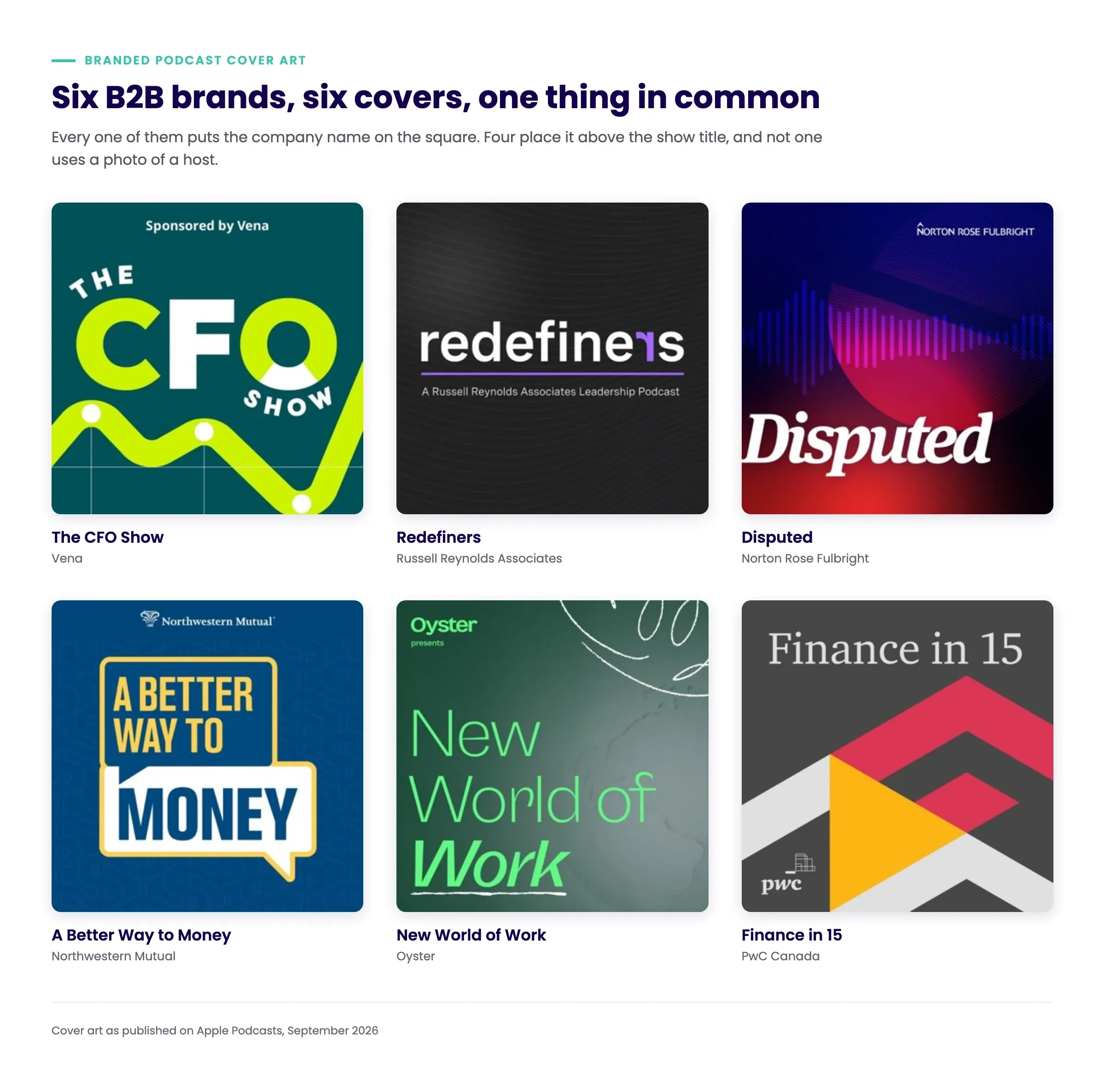
These six shows, of course, don’t represent the entire branded podcast catalogue, but they do provide us with a pattern consistent enough to be worth sharing:
- All six put the company name or logo on the cover. Not one of them leaves it off.
- Four put the brand above the show title, in the top strip. Redefiners runs it underneath, and PwC puts its logo in a bottom corner.
- The titles are short. One word (“Disputed”, “Redefiners”), three words (“The CFO Show”, “Finance in 15”), four or five at most.
- None of them use a photo of a person. Which is the opposite of what the research recommends, and probably says something about how nervous brands are about hosts moving on.
What good branded podcast covers have in common
A company logo
This is the decision that gets debated most in the kickoff meeting, so let’s take it head on.
The research says put it on. In a study run by GfK with Dutch broadcaster NPO, researchers took 20 shows, made 12 different designs for each, and showed them to more than 1,000 people in sets of four. They used a scoring method that separates how much the artwork mattered from how much the title mattered. The covers that won had three things: The show name, a photo of the host, and the publisher’s logo.
So if you opt to include your logo on your cover, here are three ways to do it (from most visible to least):
- Your logo at the top. Small, one line, sitting above the title. This is the most common approach and the safest one. Norton Rose Fulbright, Northwestern Mutual, and Oyster all do it.
- “Presented by” or “Sponsored by.” A half-step back. It gives you the credit while making clear the show stands on its own, which helps a lot when your content genuinely isn’t about your product. Vena runs “Sponsored by Vena” on The CFO Show.
- A line underneath the title. The lightest touch of the three. Redefiners uses “A Russell Reynolds Associates Leadership Podcast.”
An audience-oriented design
Now it’s time to think about who will be listening to your show. Understanding your audience allows you to create cover art that resonates with them and captures their attention amidst the 4.7 million other podcast feeds indexed today.
If you’ve already written down your ICP, you’re most of the way there. If you haven’t, do it before you brief anyone, because otherwise you’ll end up picking whichever concept you personally like best (we’ve all done it).
So start by developing a listener persona. Saying you’re speaking to “business decision-makers” isn’t enough. Something like “VPs of Finance at companies of 500 to 2,000 people, who read three finance newsletters and feel behind on AI” gives your team much more to work with. Consider these attributes when defining your ideal podcast listener:
- Age
- Values
- Gender
- Location
- Income
- Lifestyle
- Education
- Pain points
- Motivations
- Job title/seniority level
- What industry they work in
- What company size they work for
- Social media habits and preferences
- Online and offline interests and hobbies
Trying to cater your cover art to a broad audience may seem like a good strategy, but it can lead to generic artwork that fails to stand out. Instead, honing in on a specific listener profile allows you to craft visuals that will immediately appeal to your target audience (and then your show’s content will entice them to stick around).
For example, if your podcast is aimed at fast-moving tech or startup buyers, bold colors and dynamic typography can help convey energy and momentum. On the other hand, a finance or legal-industry podcast aimed at senior decision-makers will likely benefit from a sleek, minimalistic design that signals credibility and expertise.
They’re easy to read at all sizes
Podcast listeners access shows across a variety of devices, from smartphones and tablets to desktop computers and smart speakers. Your cover art must be versatile enough to look great across all screen sizes and resolutions.
Additionally, your podcast’s branding will likely extend beyond listening apps. You might use your cover art in several other formats, such as:
- Social media profile pictures and posts (Instagram, Twitter, Facebook, LinkedIn)
- YouTube thumbnails
- Website banners and blog features
- Email newsletters
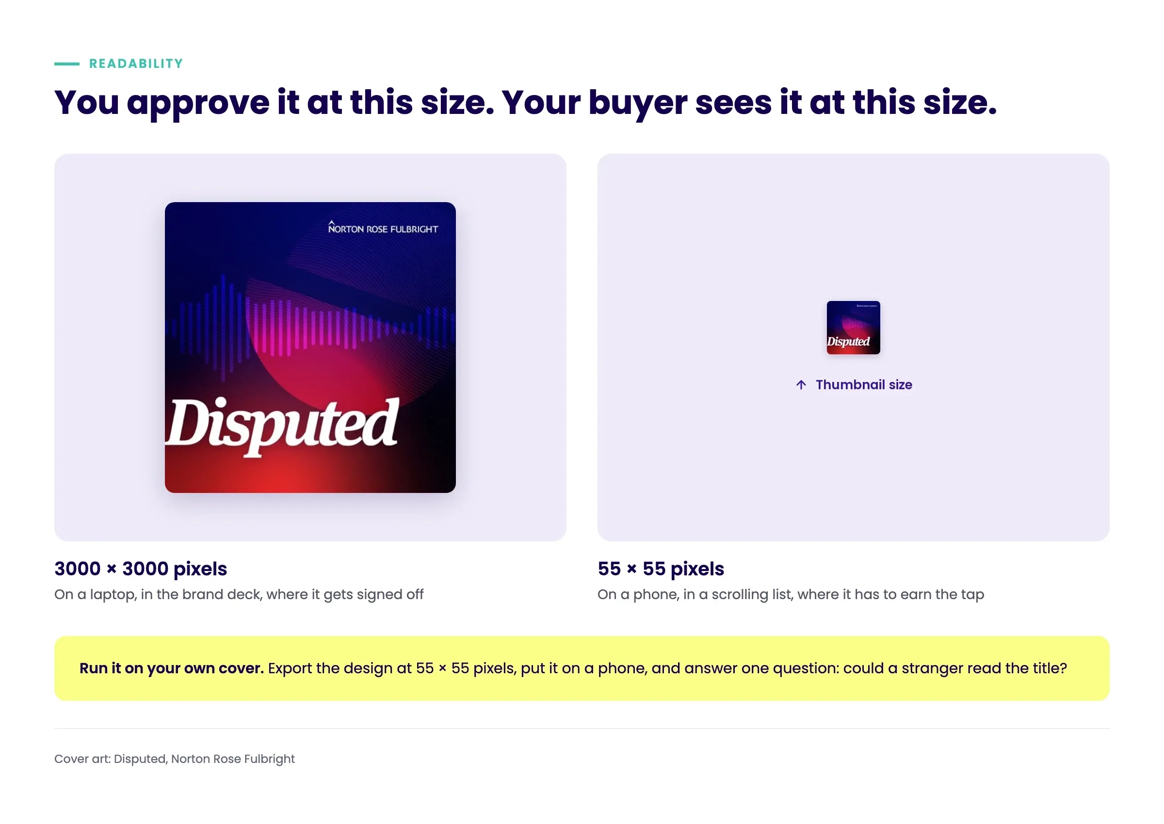
To ensure readability and clarity, use a large, bold font that remains legible even when scaled down. A good practice is to test your cover art at a small size, such as 55 x 55 pixels, to confirm that all elements remain distinct and recognizable.
Three things tend to break first at small sizes:
- Thin lettering. Light and ultra-light weights disappear before anything else. Ask for a heavier weight.
- Colors that sit too close together. Two mid-tone brand colors can look elegant at full size and go completely flat when the square shrinks.
- Fine detail. Thin lines, textures, and busy layers stop reading as detail and start reading as noise.
With that said, here’s what you need to know so your cover survives the shrink test:
Colors that survive at small sizes
For a branded show, most of the color decisions are already made for you. You’re working with the palette you have. So the real question becomes a practical one: How do you make these particular colors work in a tiny square?
Three things to check.
- Contrast, checked at thumbnail size. Your text has to hold up at 55 pixels, not at 3000. Brand palettes are usually built for big surfaces with lots of white space, and a pairing that looks refined on a website can go muddy in a square. If your main colors sit close together in tone, pull a brighter accent from the palette and use it for the text.
- Dark mode. Plenty of listeners browse with dark mode on, and a cover designed on a white background can look like a different design entirely against near-black. Check it before you sign off. Light backgrounds with light text are where this usually falls apart.
- Whether you look like everyone else. Open up the podcast list your buyer probably has. If most of those shows are corporate blue on white, yours is going to vanish among them no matter how well it’s made. Leading with a secondary or accent color keeps you on-brand while giving you somewhere to stand out.
Worth noting from those six covers I pulled: The backgrounds were teal, near-black, deep blue and red, navy, dark green, and charcoal. All dark, and mostly not the obvious corporate blue. The ones that held up best at small size committed to a single deep background with bright text on top of it.
Keep your text to a minimum (and make sure it’s legible)
Keep the list of things on your square short, in this order:
- The show title. The biggest thing, and the one that has to be readable at any size.
- Your company’s logo or name. Small, at the top or as a line underneath.
- A short descriptive line, if it earns its place. “A Russell Reynolds Associates Leadership Podcast” tells you the topic and the company in one go.
- Host names, but only if your buyer would know them.
On fonts, the only real test is whether people can read it:
- Plain, clean fonts are your safest bet. Ask for a bolder weight than your brand’s default.
- Fonts with serifs (the little feet on the letters) can feel authoritative, which often suits a B2B show. Just avoid the fancy ones with very thin strokes, because those strokes disappear when the image shrinks.
- Handwritten and decorative fonts almost never survive the thumbnail test.
And if your brand’s official font genuinely doesn’t work at this size? That’s the exception to ask for in the brief. A title nobody can read is a worse outcome for your brand than a title set one weight heavier than the guidelines specify.
The cover aligns with your content
Here’s a question worth asking about your current artwork: If someone who had never heard of your company saw it in a list, would they have any idea what the show is about?
For a lot of branded podcasts, the honest answer is no. There’s a logo, a title, and something abstract behind it. That tells a buyer where the show came from, but nothing about whether it’s worth forty minutes of their commute. Here are some things to keep in mind:
Stop signalling “podcast”
The most common way this goes wrong is microphones, headphones, waveforms, and neon ON AIR signs. They all say the same thing, which is “this is a podcast.” Your listener is inside a podcast app, scrolling a list of podcasts. They know.
Every one of those is space you could have spent telling them what the show is actually about.
Put one cue from the subject on the square
Four of the six covers I pulled above do exactly that, and none of them are complicated:
- The CFO Show runs a rising line chart along the bottom, so you read “finance” before you read the title
- A Better Way to Money sets its title in speech bubbles over a faint dollar-sign pattern
- New World of Work puts a globe behind the type, for a company whose whole product is hiring across borders
- Finance in 15 builds a play button out of PwC’s own chevrons, signalling the brand and the format in one shape
One cue is the target here, not a collage. And notice that none of these are literal illustrations of the topic. A line chart is not a picture of finance. It’s just enough for someone to place the show in a second.
Decide what your title is doing first
Your title and your artwork should not both be doing the same job, and this is the decision most teams never actually make.
If your title is literal, the artwork is free to set a mood. “The CFO Show” already tells you exactly who it’s for, so the design can focus on tone.
If your title is one evocative word, the artwork or a line underneath has to carry the topic. “Disputed” could be about anything. The cover answers with a clashing red-and-blue color story and the firm’s name up top, so you land on legal conflict. Redefiners solves the same problem with words instead, running “A Russell Reynolds Associates Leadership Podcast” under the title.
Match the tone, not just the topic
A show about regulatory compliance and a show about startup culture are both “about business,” and they should look nothing alike.
Tone is what tells a buyer whether this show is pitched at their level. Dense, restrained, and serious reads as senior. Bright and playful reads as practitioner. Get this wrong, and you’ll pull in the right industry at the wrong seniority, which is the single most common mismatch we see in listener data.
A brief to send your designer
Alright, let’s make this easy. Copy the block below, fill in the blanks, and send it. It covers the things designers can’t guess and the things that usually cause a second round.
- Show: [Name]
- Who it’s for: [Job title, company size, industry. Two sentences.]
- What the show is about: [One sentence.]
- Company brand: [Which logo version, and whether a smaller simplified version is approved for podcast use.]
- Colors: [Which palette colors are in play, and which one you’d like to lead with.]
Must-haves:
- Main file at 3000 x 3000 pixels, square, RGB, JPG or PNG, no transparency
- Show title readable at 55 x 55 pixels
- Company name or logo on the cover
- Bottom fifth of the square kept clear of anything important
- Five words or fewer on the square
Also deliver:
- 1280 x 720 YouTube thumbnail
- 1200 x 627 and 1080 x 1080 social versions, with the layout adjusted rather than cropped
- See-through PNG of the show logo on its own
- A wide banner version for the website
- The original design file (AI, SVG, or EPS)
Before you send it back: Please include a 55 x 55 pixel export and a version shown against a dark background.
Before you sign off, five quick checks, in the order that catches problems soonest:
- Can a stranger read the title at 55 pixels on a phone?
- Does it hold up against a dark background?
- Is anything important sitting in the bottom fifth?
- Put it in a screenshot beside five shows your buyer already listens to. Does it disappear?
- Do you have all the other sizes and the original design file?
How to tell whether your branded podcast cover art is working
Let’s be honest about this one: You can’t run a proper A/B test on podcast cover art. The apps don’t offer it, and the moment you swap the file, it goes live everywhere at once.
What you can do is treat a redesign like any other campaign change and watch three things for a quarter:
- New listeners, on their own. Your regular listeners will keep listening no matter what the square looks like, so a total download number won’t tell you much (our guide to podcast benchmarks covers what that number is actually good for). What you want to know is whether more strangers are going from scrolling to pressing play. Look at new listeners month over month, and check it against your publishing schedule so you don’t mistake a strong episode for a strong cover.
- Channel performance. Tracking Links give you a separate link for every place you promote the show, so you can see whether your social and newsletter placements convert better than they did before.
- Who’s showing up. This is the one that matters most for a B2B show, and it’s why we built B2B Analytics. You get the companies listening, their industry and size, and the job functions and seniority levels behind the plays. So if you redesigned to reach VPs and six months later your data still shows mostly junior listeners, you’ve learned something useful: The cover isn’t your problem.
That last point deserves a moment, because it’s the most common wrong diagnosis in branded podcasting. Cover art affects whether someone tries your show. It doesn’t affect who finds it in the first place, and it doesn’t affect whether they stay. So if the wrong people are listening, a redesign won’t fix that, and our guide to matching your listener data to your ICP covers what will.
Judging a branded podcast by its cover
Cover art won’t make your podcast succeed. Plenty of great shows have mediocre covers and grow anyway, because the content is worth subscribing to.
But it’s one piece of work that shows up every time your show does. You design it once, and then it sits beside every episode, in every app, for as long as the podcast runs.
It also reaches the people who never listen. Someone who scrolls past without pressing play has still seen your company’s name next to a show about their industry, and enough of those add up to recognition you’re getting from work you already did.
So: Put your name on it. Make it say what the show is about. Test it at 55 pixels. Then go find out who’s actually listening with B2B Analytics and Advanced Audience Demographics, because that’s the part a cover can never tell you.
Want to see what that looks like on your own show? Book a demo with our team.
Or, to keep up with all things branded podcasting, subscribe to our bi-weekly newsletter, Tuned In.